


Wallpaper Trends: 5 Styles To Refresh Your Walls With
When no one colour is doing it anymore, patterned wallpaper will bring the vibes that your artistic eyes are searching for.
Picking the colour for your home is anything but easy. When you have all the colours to choose from and plenty of ideas running around, finding the right one can be a task.
But you’ve chosen the farmhouse look. A style that looks beautiful in any home and can brighten any room. Luckily, when you’re going for the classic farmhouse look, the colour palette is less about making a statement and instead, about becoming the canvas for the furniture and decor to make their own.
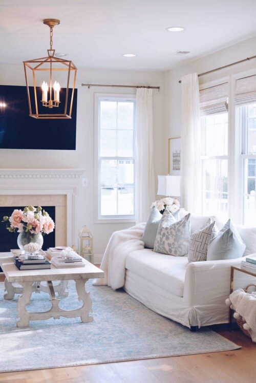
The ultimate colour that we all know of farmhouse interiors all too well is white. A colour that can do wonders to small and large spaces, open up a closed room, and make use of the natural lights that shines through the windows. That’s not to say, it’s the only colour. Neutral colours with a soft undertone of beige or grey, also fall into the farmhouse colour palette which we’ll delve into a little more below.

As with any project, it’s worth doing a bit of a run-through on what the end goal looks like. You may be starting entirely from scratch in your home or looking to do up a few rooms that have been on your list for a while.
The first thing would be to take stock of what you’ve already got, and see how that falls in line with the farmhouse look that you’re going for. When considering the rooms you’ll be painting, take note of the floor plan and ask yourself 3 questions to get you started:
The answer to these questions will help to guide you on what colour and tone to go for that will complement the assets of the space and furnishings.
A farmhouse-inspired home is typically centred around a laid back neutral colour palette; using colours that are charming and can easily complement antiques or rustic furnishing inside your home. Whether you’ve decided to go classical, vintage, or french this guide will help to find what colours work best for you.

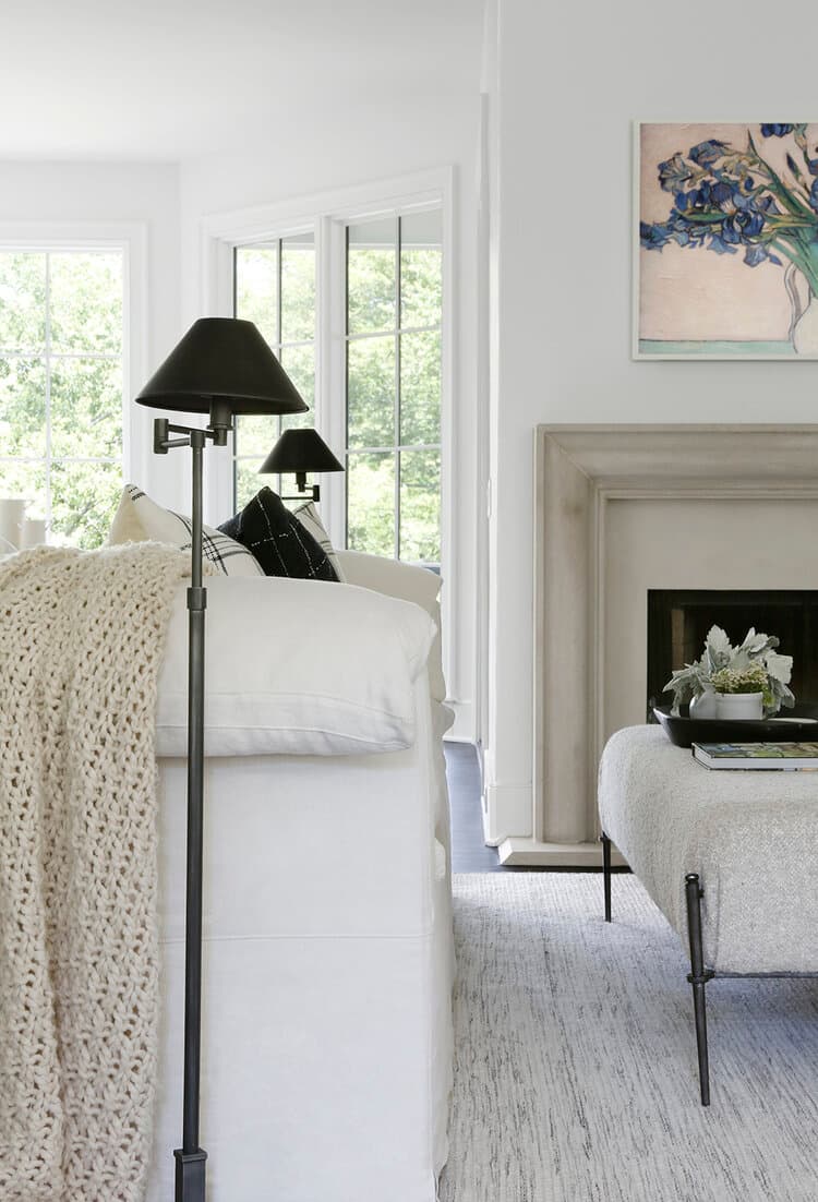
This is the white paint of dreams. If you’re going for the all-white look, this colour is the best one to go for and will go with just about anything you already have in your home. All White is pristine, elegant, and can be jazzed up in just about any way you like whereas Wimborne White has a slightly creamy undertone to it, making it the perfect colour for the farmhouse looks. Bonus, whites tend to be light reflective meaning the colour helps to reflect twice as much light back into a room.
If you’re looking for a hue with a slight grey undertone, that works beautifully inside a contemporary home with farmhouse elements, Strong White is a favourite.
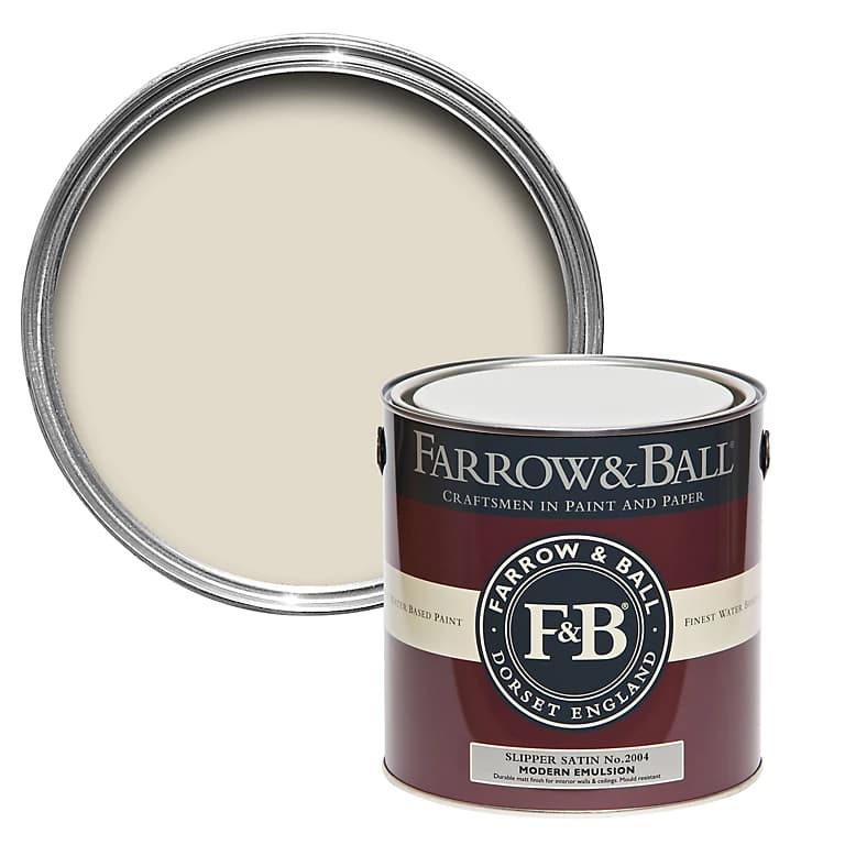
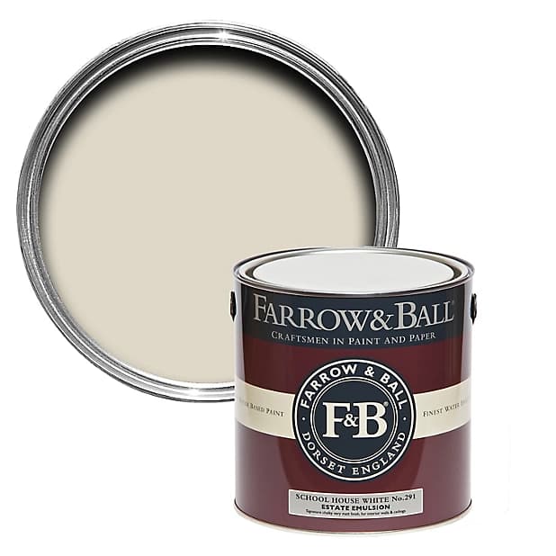
Cream or beige colours can be the perfect way to bring a soft, cosy feel into a space if you prefer something different you white. Slipper Satin is a laid back colour that demands very little and can be paired with whites or darker shades. The muted creamy undertone in School House White makes the shade an ideal colour for a traditional farmhouse-inspired kitchen or entryway.
Whereas going for a shade with a richer cream tone is a great way to offset rustic decor and brings a sense of calm into a room. A darker tone of cream such as Pointing which offers a red undertone, will lift your farmhouse-inspired home beautifully and works particularly well for full coverage or on a feature wall.
Highlighting the neutral elements in the room, Dimpse offers a light grey with a cool blue undertone that creates a serene look that would work beautifully inside a bedroom or hallway. Similarly, Pavilion Grey has a blue undertone to it but offers a warmer shade of grey that could work as full coverage for the kitchen; as it works especially well paired with white cabinetry. A combination that’s proven Instagram-worthy.
Now, even when you’ve chosen light shades as the foundational colour palette for your home, it doesn’t mean you need to opt-out of darker tones entirely. This Manor House Grey works perfectly for feature walls in the bedroom or dining room, when combined with the white tones mentioned above.
It’s important to understand what undertones mean when it comes to painting, and how to identify them when choosing particular shades. Most colours will have a selection of what looks like the same colour; that colour that you see at a glance is the mass tone. Whereas, the soft colour you notice once you’ve applied it to the wall; tones of reds, blues, or greens, for example, is the undertone.
Once you’ve chosen a colour, make sure to check out the paint description as it will include any secondary colours that have influenced the main colour. If not, then the best way to identity undertones in a colour is to buy a sample and paint a small part of a wall where the light is bright.
If you’re yet to decide on what you think might work well in your home… fear not. We would recommend to keep looking out for inspiration, make friends with Pinterest for ideas, and follow these interior designers whose portfolios we absolutely love.
Photo credits: 1. April Tomlin 2: Studio Mcgee 3: Studio Mcgee


When no one colour is doing it anymore, patterned wallpaper will bring the vibes that your artistic eyes are searching for.

Christmas at The Ritz London is more than just a celebration; it’s an experience that embodies classic British elegance, warmth, and timeless tradition.
Elevating your dining room so that it's fit for any occasion doesn't have to cost the earth or take up all your time—here's how.