The technique we've fallen in love with: Colour blocking. Bring two (or more) bold colours together for a vibrant, open space.
Posted on29th October 2021
Words ByJackie Grimes
TagsHow-ToInspirationMid CenturyTrends
Colours can be the strongest tool when applied in interior designs; understanding how they can be ‘used, mixed, balanced, and mastered’ is how the likes Nadia Olive Schnack came to fall in love with the effects of colour and made it her life’s work to bring into the spaces we find ourselves in. Understandably, using colour doesn’t come intuitively to everyone especially when it comes to marrying two hues together through the likes of colour blocking. If you’re unfamiliar with the interior technique, then well… Let me enlighten you. We look at everything from what colour blocking actually means in interiors and how to apply inside your home, if you’d rather for all the goss you can do that too.
What does colour blocking mean?
The technique is widely thought to originate from the Dutch painter Piet Mondrian, whose iconic abstract paintings of the 1920s inspired Yves Saint Laurent amongst others. As with many great ideas, colour blocking spilt over into many aspects of design; from fashion to architecture, graphic design to interiors. It’s considered a modernist technique in the world of interior design, thanks to its debut that took off in the 60s. Synonymous with contemporary and modern design, the technique takes solid colours, usually opposites on the colour wheel (but hey, no rules round here) and pairs them together to make a bold statement inside a room.
Best colours to colour block in your home
Colour blocking has become a love of mine for a while. Not only does it show off the inner artist in you, but the very essence of bringing bold, bright colours into your home will do so much more for your space. With how it looks and how it feels. It inspires creative ideas on how you decide to bring colours together, as well as shuffles the dynamics in a room; whether it be a vertical block to section off a part of the room, horizontal block to widen a narrow space, or accent elements using shapes to add a vibrant pop of colour.
Striking colours for a retro vibe
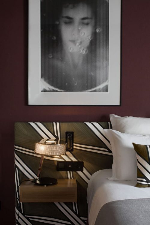
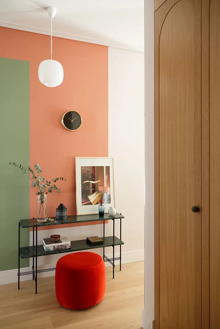
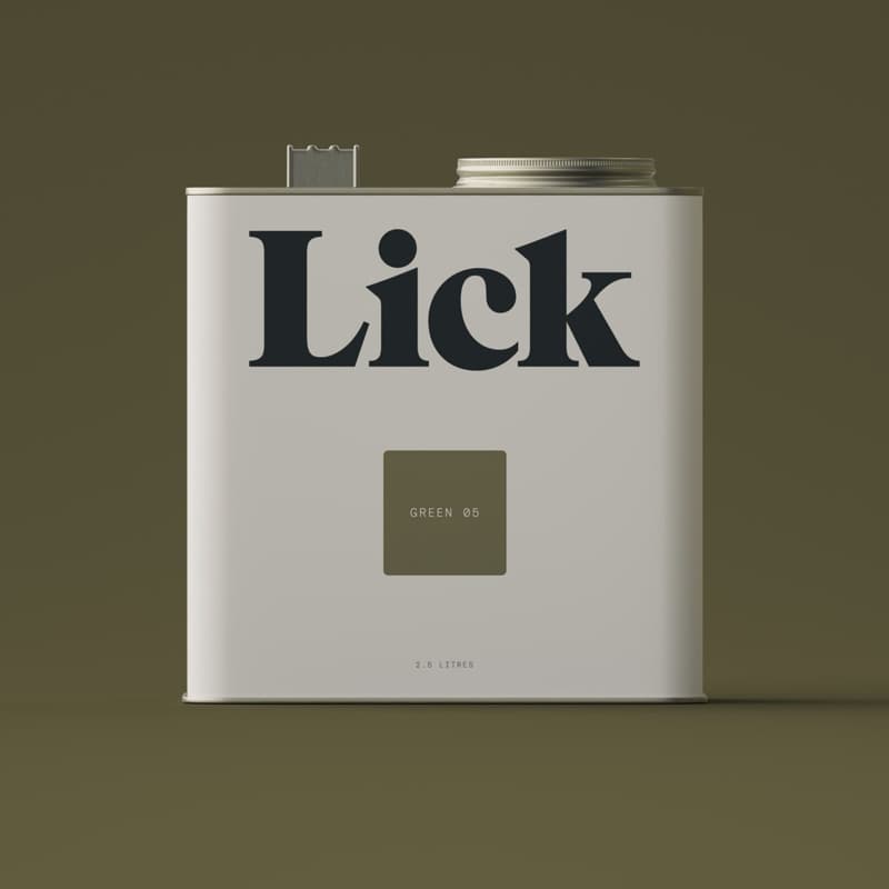
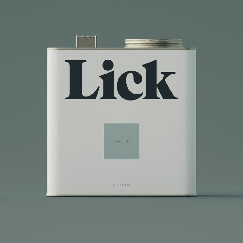
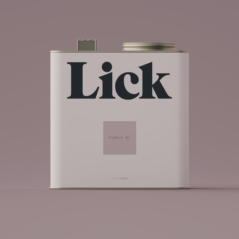
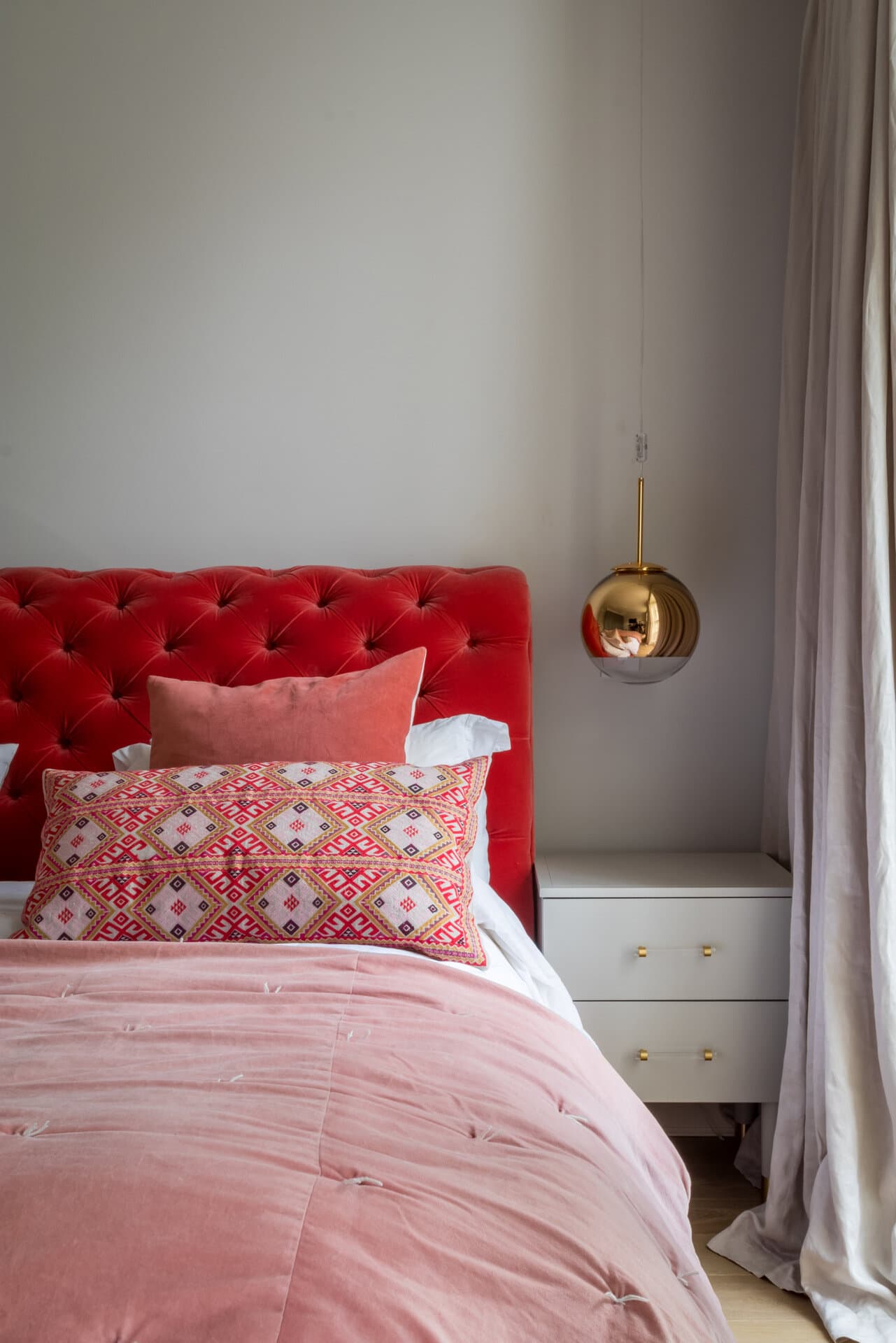
For the rooms that are calling out for a new outfit, or an entire makeover, then colour blocking will give it the standout backdrop for stylish, modern furniture. Creating a stunningly dynamic space you’ll never want to leave (perhaps then best suited for the home office… or bedroom?). To incorporate vibrant colours that contrast each other and, important: are complementary together for colour blocking, we’ve turned to one of the up and coming luxury paint brands, Lick for their miraculous colour range.
Using bright bold colours work beautifully when you have arches or coves in a room that break up straight lines and walls. If you’ve got these features to work with, I would suggest applying No. 02 Yellow as a base with No. 05 Green for the arches and coves for a mid century modern look. Whereas, for a contemporary or eclectic look you could opt for blocks of shapes and using well-toned colours to the walls to give a sense of depth as well as calm. For this, apply No. 01 Teal as the base with No. 01 Purple for the shapes to create a space that’s relaxing, and vibrant. All at the same time.
Remember in school when you were taught how to create a shadow effect in drawings? Well, it’s time to flaunt what you learned because it applies in interiors too. And dare I say I much prefer it used here than I did back then. Shadowing has long been a technique used amongst artists to cast a shadow in their paintings to make them appear more realistic and to simulate natural daylight.
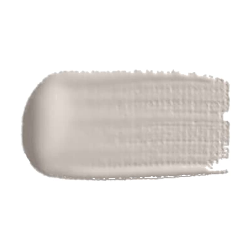
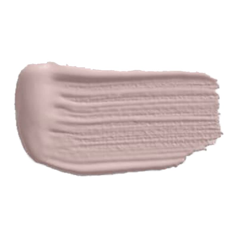
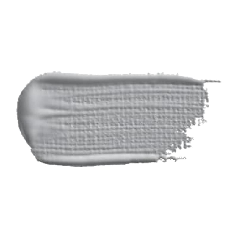
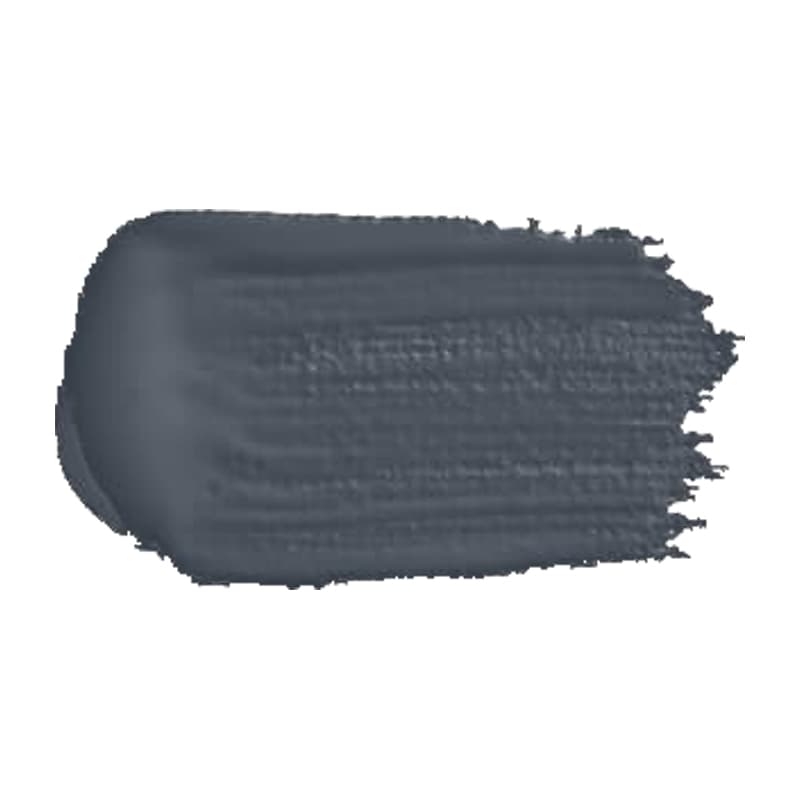
In interior design, you could say it’s similar although here it’s about creating a shadow using the same tones with a different hue on your walls. We’re turning to Cox & Cox as their new premium range offers a beautiful range of shades that are simply timeless. For a contemporary look, No. 901 Deauville works perfectly as a base when paired with No. 909 Marlott as the colour block, the two combined offer a contrast that is ever so slight but enough to make a statement. Likewise, for darker shades or a monochrome look, No. 504 Cobble is majestic and No. 905 Nocturne is its colour block companion.
Colour blocking is a technique that is as diverse as the colours you can bring together. If you’re feeling adventurous and open to binding two colours, colour blocking may well be the way to go. It’s one of my favourite ways of expressing yourself through interior design and plus, what’s the worst that could happen? If it doesn’t work out, it takes a lick of paint to go over and try a new combo again. And while some stick to colour blocking on the walls, others may decide on colour blocking the paint that they use to contrast with the furniture or fabrics; as I say there are few rules around here.