

Spring Living Room Refresh: 10 Effortless Ideas to Transform Your Space
Spring is the perfect time to breathe new life into your home, and where better to start than the heart of it all—with a spring living room refresh?
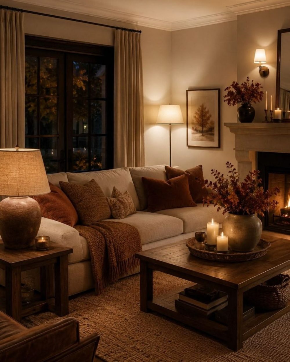
There is a moment every year, usually around the first week of September, when the light changes and the house asks for something warmer. The linen that looked crisp in July suddenly looks thin. The pale walls that felt airy now feel a little bare. That is the cue for an autumn colour palette, and the good news is that you do not need a decorator, or touch a paintbrush, to bring one home.
The trick with autumn colour is to think in palettes rather than single shades. One rust cushion on its own can look like an accident. Rust beside olive, ochre and plum looks like a decision. Below are seven combinations we keep coming back to, with the mood each one carries, the rooms where it works hardest, and one low-commitment way in. If you do reach the repainting stage, our guide to choosing a paint colour that actually works will save you from testing eleven shades of brown on the landing.
The definitive autumn pairing. Rust brings the warmth of turned leaves, bottle green holds onto the garden, and together they feel rich without tipping into gloom. Add cream or oatmeal as a base so neither colour has to shout.
The mood: generous, grounded, a little bit country house. Where it works: living rooms and snugs, anywhere you gather in the evening. The easy way in: a rust throw and one olive or bottle green velvet cushion on a neutral sofa. That is the whole job done for under fifty pounds.
Plum is autumn’s quiet luxury. It reads as near-neutral in low light, then glows when a lamp comes on. Ochre is its perfect foil, a mustardy gold that stops the purple feeling formal. This is the palette for people who find orange a bit obvious.
The mood: moody, warm, faintly Victorian in the best way. Where it works: bedrooms, dining rooms, and any room used mostly after dark. The easy way in: a plum velvet cushion and an ochre wool blanket folded where the light catches it. Brass accents finish it beautifully.
If your home leans relaxed rather than dramatic, this is your autumn. Terracotta is softer than rust, more baked earth than bonfire, and against cream and mid-tone oak it makes a room feel sunlit even in October drizzle.
The mood: easy, Mediterranean gone north, quietly rustic. Where it works: kitchens, hallways and family rooms that need warmth without darkness. The easy way in: terracotta pots, a clay-toned table runner, or a stack of warm-toned ceramics on open shelving.
Tonal brown is everywhere at the moment, and autumn is when it earns its keep. Layering toffee, deep chocolate and a flash of burnt orange gives you depth without contrast, which is why brown rooms feel so calm. We looked at where brown is heading in our round-up of the interior trends we are actually seeing in 2026, and this palette is the wearable version.
The mood: enveloping, seventies-adjacent, very current. Where it works: living rooms and studies, especially with wood floors. The easy way in: a chocolate corduroy or boucle cushion against tan leather, or a caramel throw over a darker sofa.
Not every autumn palette needs to be brown. Mustard against a deep inky blue is high contrast done warmly, the yellow reading like lamplight against an evening sky. It suits homes that keep a bit of Scandi crispness year round.
The mood: smart, graphic, cheerful on a grey morning. Where it works: home offices, kitchens, and rooms with good daylight. The easy way in: a mustard cushion or lampshade in a room that already has navy, or the reverse, one navy accent in a mustard-friendly neutral room.
Red is the boldest autumn move, and the way to wear it is tonally. Deep oxblood carries the drama, dusty rose softens it, and together they feel considered rather than festive. Keep woods dark and metals aged for the full effect.
The mood: romantic, grown up, faintly Parisian. Where it works: bedrooms and dining rooms, or one very confident hallway. The easy way in: an oxblood cushion cover or a rose-toned lampshade. This palette is potent, so start with one piece and live with it a week.
The quiet one, for minimalists who still feel the seasons. Camel is the warmest of the true neutrals, and next to charcoal and cream it gives you autumn’s cosiness with none of its colour. This palette also survives into winter and spring untouched, which makes it the best value scheme here.
The mood: calm, tailored, timeless. Where it works: anywhere, honestly, but it is especially good in bedrooms and open-plan spaces. The easy way in: a camel wool throw. It may be the single most useful autumn purchase there is.
Whichever scheme catches you, resist the urge to buy the whole set at once. Bring in one or two pieces, watch how they sit in your light, and let the room tell you whether it wants more. Autumn colour rewards patience. And it does not have to stop at the back door, if you have a sheltered spot outside, the same warm tones carry beautifully into an outdoor room for the last of the mild evenings.
The season is long. There is plenty of time to get it right.

Spring is the perfect time to breathe new life into your home, and where better to start than the heart of it all—with a spring living room refresh?
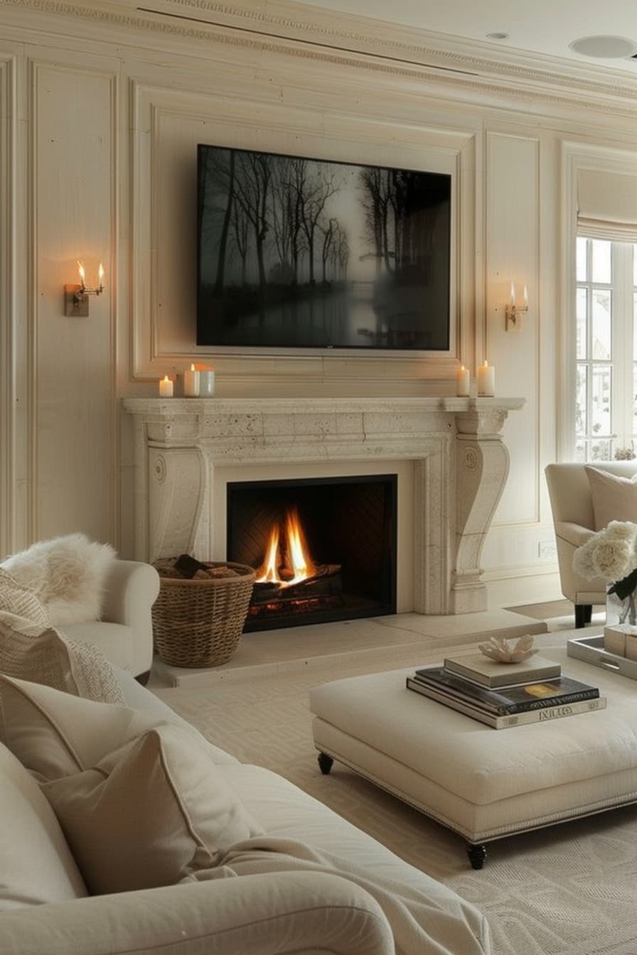
Ready to create a home that instantly impresses? It’s those little details and statement features that turn a space into something truly special

No need to throw the baby out the bathwater when redesigning your bathroom, focus on these four features before anything to know what's needed to elevate the space.