


Moving Home In 6 Weeks? Your Checklist for Getting Ready Before a Move
Nobody likes to feel rushed. If there's a way to lessen the stress of moving into a new home then we're here to help.
When we talk about sprucing up our homes, it’s less about changing everything. Instead, it’s thinking about how we can add light touches and updates to a room for it to flow with the change seasons that inevitably welcome a refresh; be it our wardrobe or interiors.
As we come up to Spring, I’m on the hunt for light and bold colours that can be worked into a room lightly through accessories and decor, or applied as a base on the walls and furniture. The season welcomes a gorgeous selection of colours that straddle across whites and creams, light pastels, and rich earthy tones. It’s wide, it’s varied, and there’s something for all styles.

For our Spring 2021 colour guide, I’ve turned to Farrow & Ball for their stunning (and eco-friendly) paint collection to scout out the colours and shades that allow for personalities to shine, without having to make boisterous bold statements. While there are some shades lighter than others, you’ll find colours that feel less of a commitment, highlight the best elements of spring and summer, and leave enough room for accessories and soft furnishings to do most of the talking.
It feels rude not to talk about colour trends without eluding to Pantone’s Colour of the Year. Illuminating, a bright flamboyant yellow has been chosen for its’ resonance with strength and positivity; anticipation for the future and for sunnier days. Ultimate Grey is Illuminating’s companion and colour of contrast, with its practical and foundational ambience. When together, they work beautifully although when used by itself, I’ve found grey to leave little wiggle room when trying to make your home a reflection of your personality.
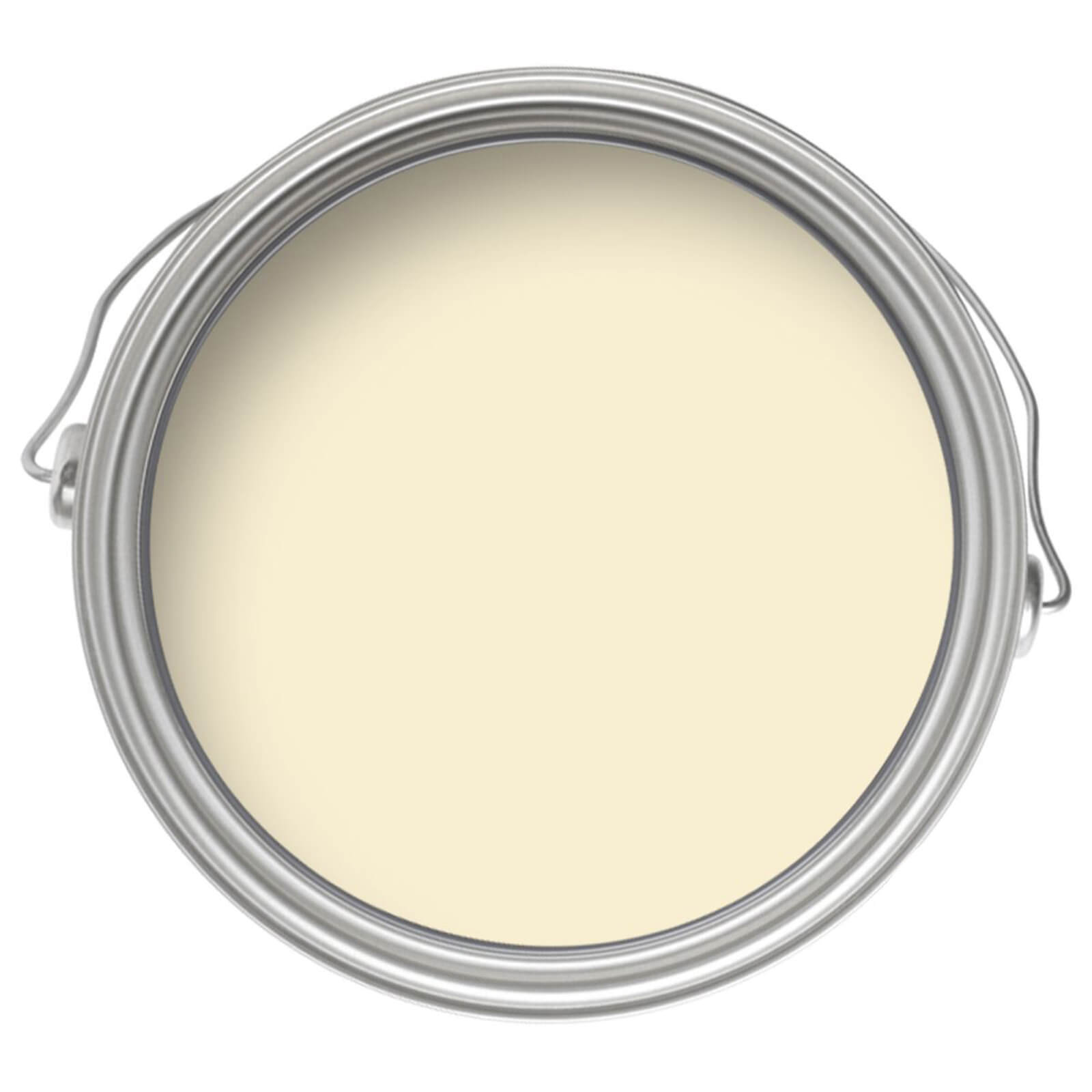
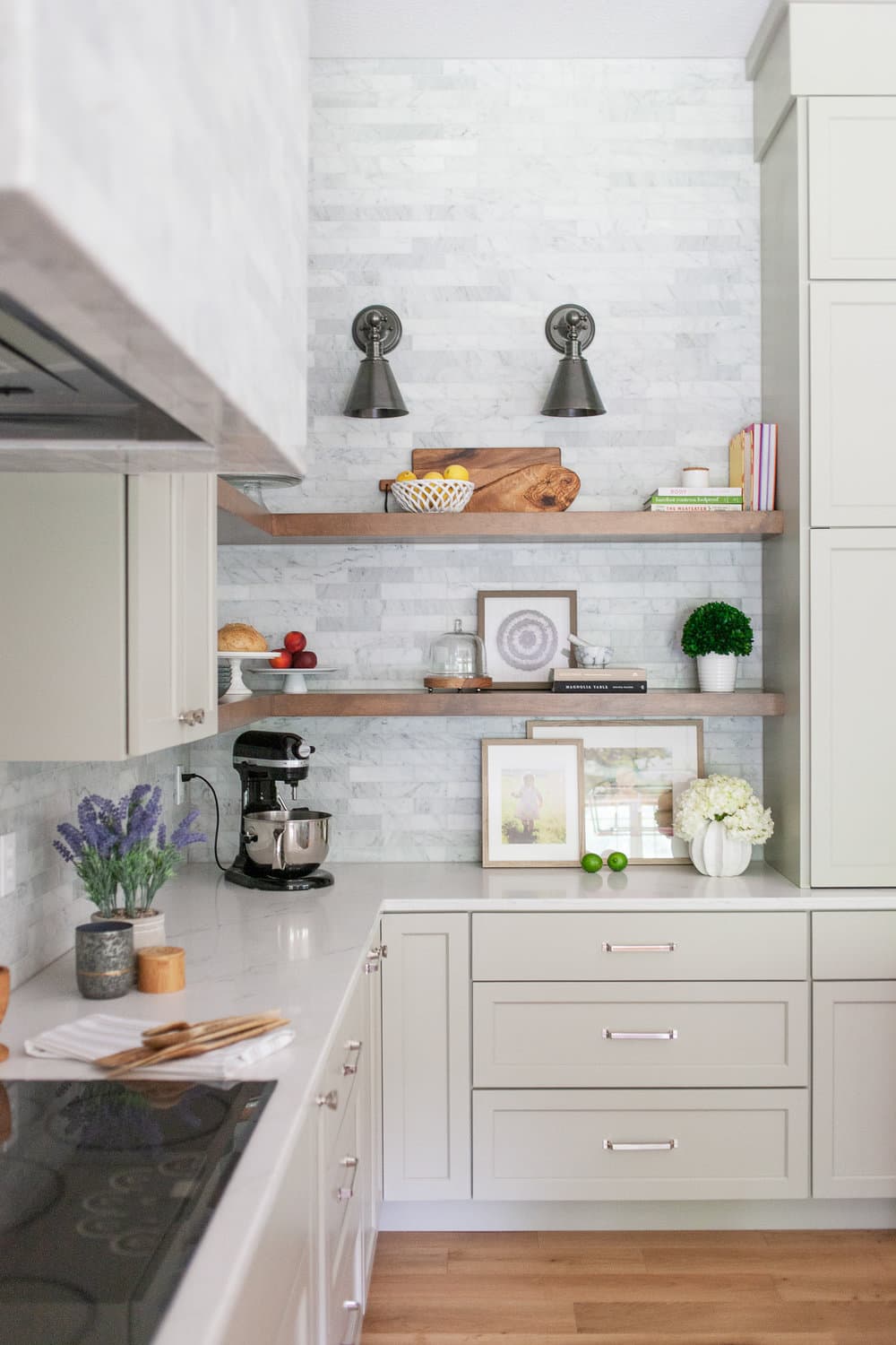
As brighter days are upon us, Spring feels like the perfect time to bring yellow into your home. You could start as light touch as Tallow, a pale cream with the slightest of yellow and pink pigments, which would work beautifully in a kitchen. While for the living room, Sudbury Yellow brings the classic rich mid century glow.
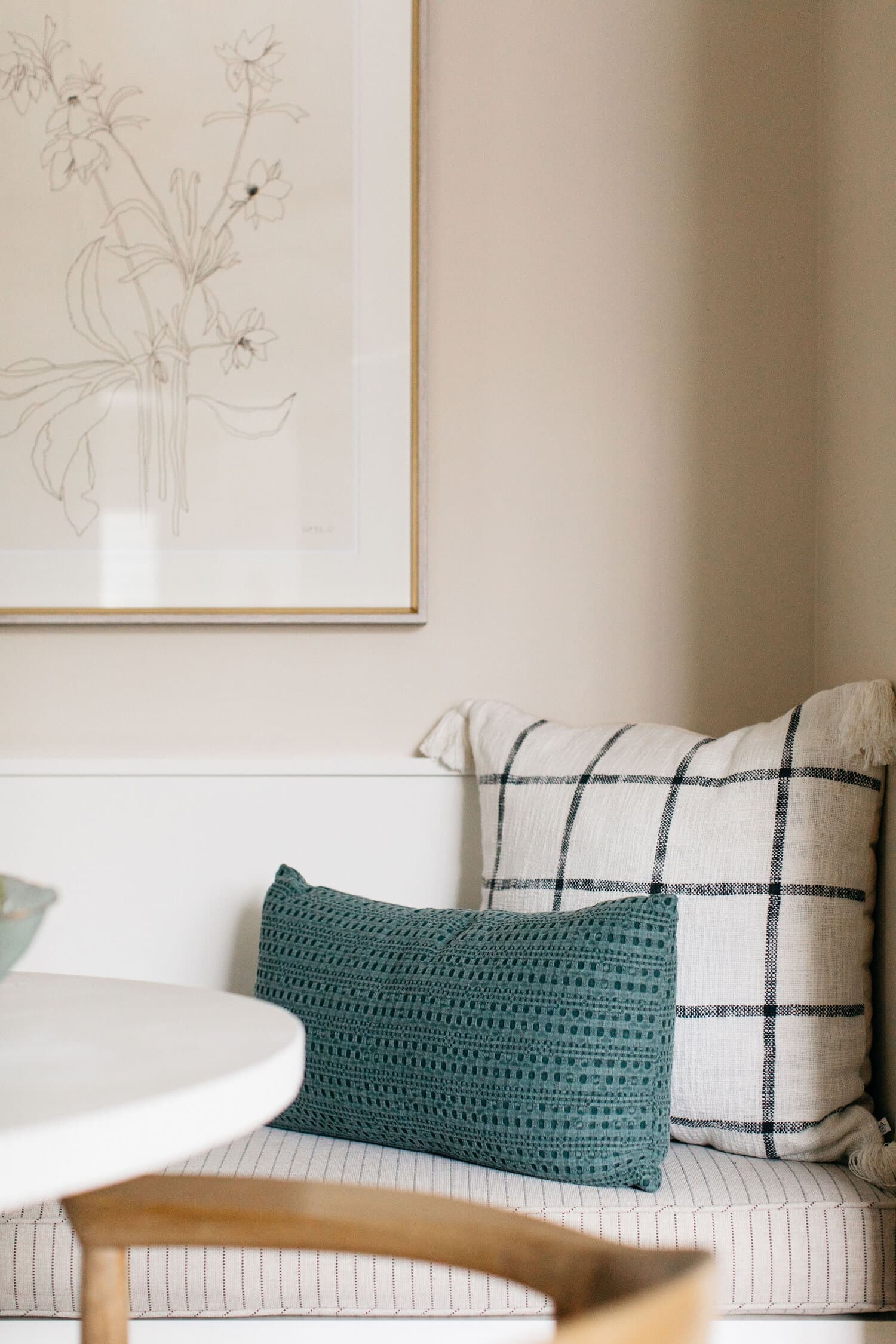

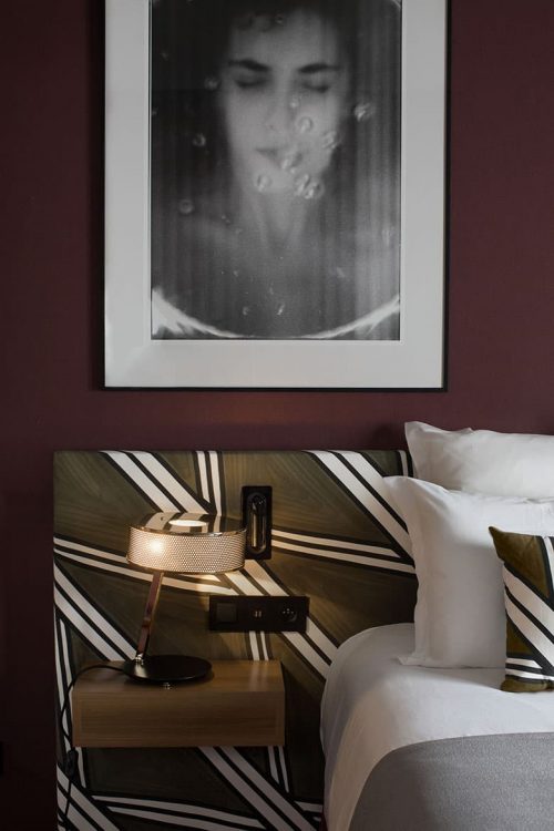
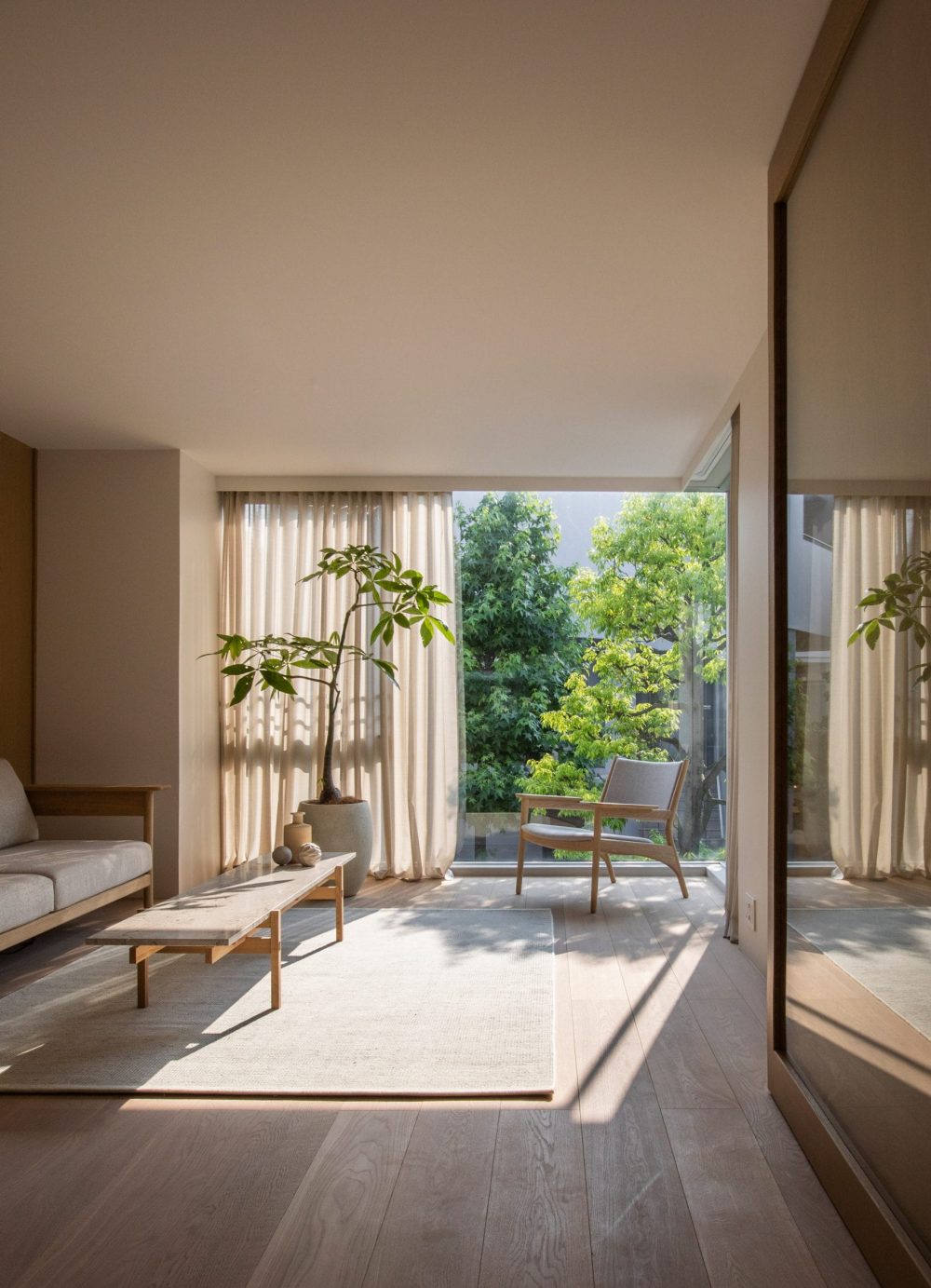
Looking ahead to what’s to come, many of us are rethinking our living spaces and how we can shake up the design of rooms to better suit new working or living environments. We’re looking for new and minimal ways to make our bedrooms calmer, and our homes more conducive for our wellbeing with nature-inspired elements. With that, comes a fondness towards muted colours and tones, pink included.
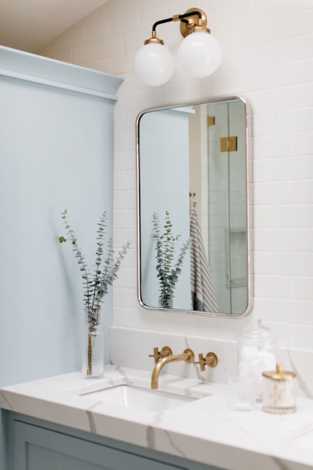
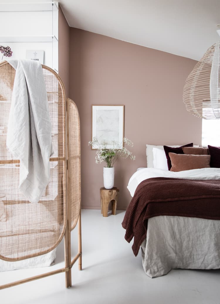
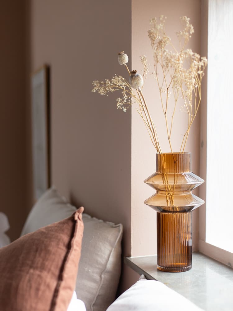
For the bedroom, a delicate pastel pink such as Middleton Pink can bring a playful look and feel if you’re wanting a colour more contemporary. Whereas Sulking Room Pink evokes an earthy natural feel with a warm glow into a room; perfect for the bedroom or living room. Alternatively, you could opt for Setting Plaster, a gorgeous shade that creates a base for dark wooden elements, or contemporary features and greenery in a bathroom.
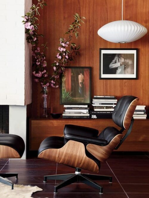
Maximising nature and natural elements have been a must for 2021. We’re discovered new, fresh ways to embed what we love about the outdoors, and ultimately are drawn, into our homes and it feels less of a trend and instead, a way of living.
While Cottagecore and Grandmillenial invite us to experiment with floral prints and whimsical fabrics, a subtle version of both would be to look at how you could add green into your home. Cooking Apple Green is a toe dripped into the vast pool of green shades, its vintage aesthetic makes for a beautiful addition for either a kitchen or living room. While Yeabridge Green captures the essence of a periodic home, that too could work in a contemporary kitchen.

Calm and relaxation is synonymous with blue and welcomes us to experiment with new shades that we’d previously overlook. Unsure of where to use them, and how we’d use them. The fresh spark of creativity and perspective of how we view our interiors is a window into seeing what’s to come, and what we’re looking to for our inspiration.
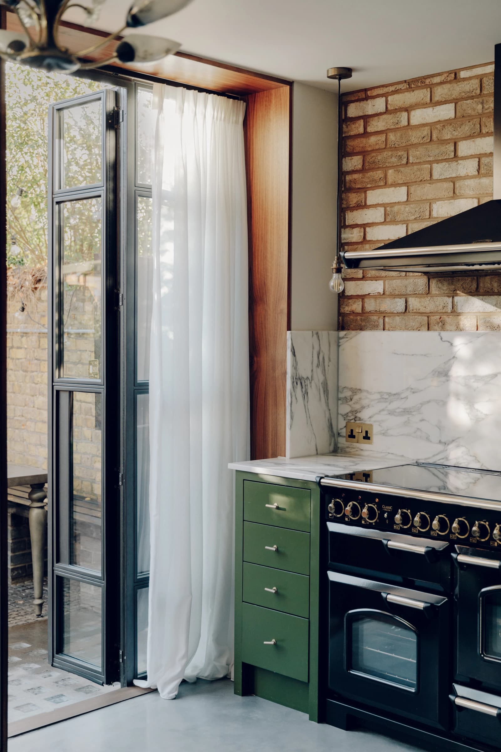
Take the fresh green-blue of Pavilion Blue, inspired by the royal pavilion in Brighton; A treasure rich in history, architecture, and design. Pavilion Blue is a shade perfect for the bathroom to inspire those at-home spa retreats. While Hazy, a muted blue-grey inspired by the early mornings of the coast, encapsulates everything you’d want when it comes to incorporated a blue shade that is calming in nature yet contemporary in design.

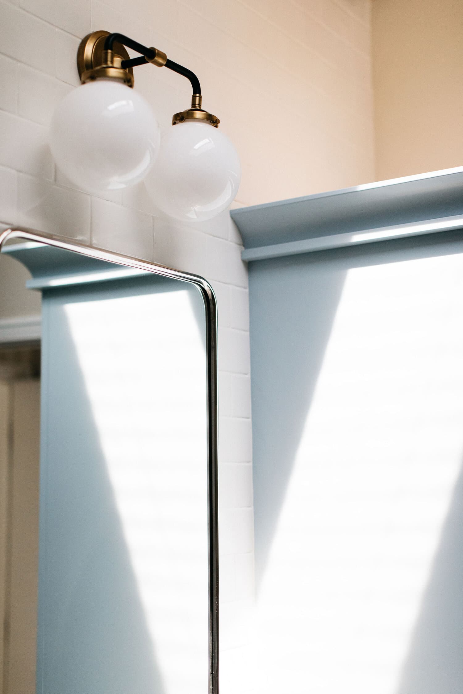
Photo Credits: 1-2. Scout & Nimble 3-4. Kira David Design 5-6. My Scandinavian Home 7-8. The Modern House 9-10. Kira David Design


Nobody likes to feel rushed. If there's a way to lessen the stress of moving into a new home then we're here to help.
From shiplap walls to vintage harvest tables, here is our guide on how to bring farmhouse interiors into your home.
Obsessed with the serene aesthetic of Japandi interiors? Then, these are our favourite accounts you won't want to scroll past.